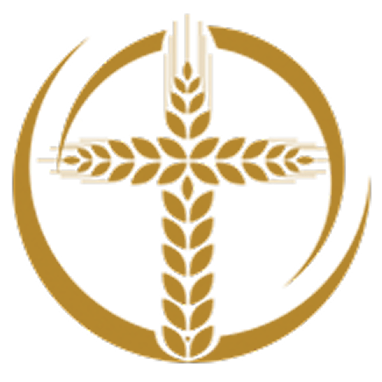
Our refreshed NRVC logo blends tradition and innovation to radiate continuity and hope!
- CATALYST
- Mar 11
- 1 min read
Author(s)Sister Deborah M. Borneman SS.C.M., Director of Mission Integration
The National Office Leadership team and Board collaborated with Mr. Rory Dayton from VocationCRM to update our logo as we move towards a fresh website. We reviewed multiple options, ranging from a completely new design to adjustments to our current logo. After several energetic discussions, we decided to refresh our familiar, recognizable logo!

This professional design begins with the recognizable open circle in motion, signifying approachability, adaptability, and inclusivity across cultures in a leaderful community. Its ever-moving circular shape immediately calls to mind the Eucharist-the Body of Christ-drawing our focus to the cross at the center, a clear reminder that our mission is firmly rooted in Christ. The bold wheat cross represents our collective response to be radical disciples inviting the next generation to respond to God's endless call.
The goldenrod hue represents the warm, earthy tones of creativity, celebration, and vitality. Goldenrod is a welcoming bridge uniting the bright joy of yellow with the deep, rich gold connected to the cultural wealth of diverse charisms, spiritualities, and missions represented in our membership. The maroon color used in our acronym and organizational name blends red and brown hues, evoking a sense of shared oral traditions and resemblance to the blood of Christ. The updated font conveys the confidence, reliability, and radical availability of vocation ministers serving together for the ongoing transformation of the world!
Comments